Marcus Kelly: the Portfolio
Web design & development, brand identity
Context
Scope
I approached this portfolio as a full brand and product build, developing my visual identity, typography, layout system, and responsive web structure. This included designing the interface, researching, refining interactions, and building the site in WordPress from the ground up.
Client
This portfolio presents “Marcus Kelly” as a designed identity rather than a personal profile. The brand prioritizes a sense of clarity and calm pacing, guiding how identity, layout, and digital experience take shape throughout the site.
Challenge
Translating that identity into a functional website required clarity and restraint, balancing personality with usability and simplicity with expression. I needed the portfolio to feel confident and intentional while still keeping the work at the center of the experience.
Solution
I designed a portfolio with a clean, structured, and editorial feel that keeps the work at the forefront. A simple SCSS layer supports consistent spacing and component styling, while the WordPress foundation ensures the site can grow and adapt as my work develops.
Research and inspiration
Here are the notes I created when planning this portfolio site.
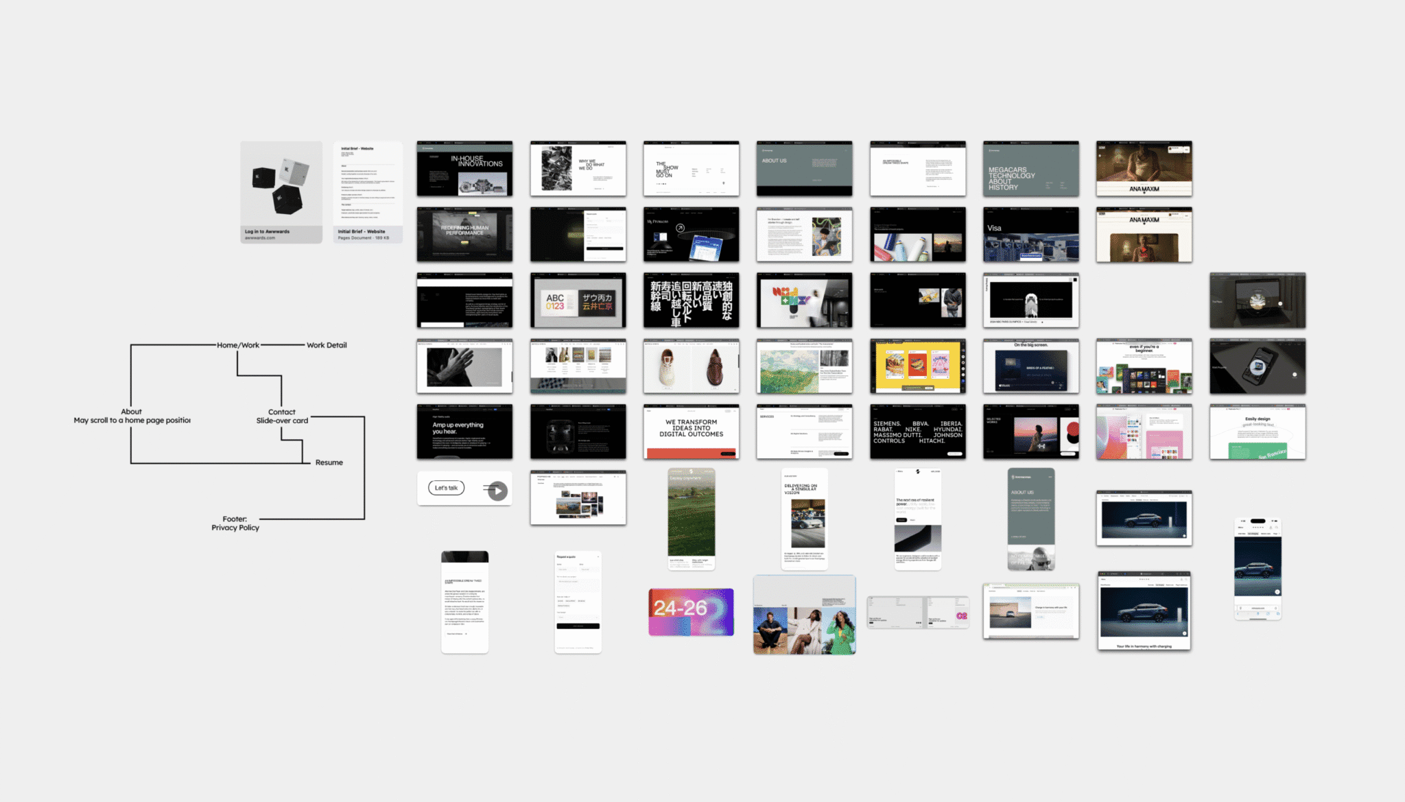
Sites featured
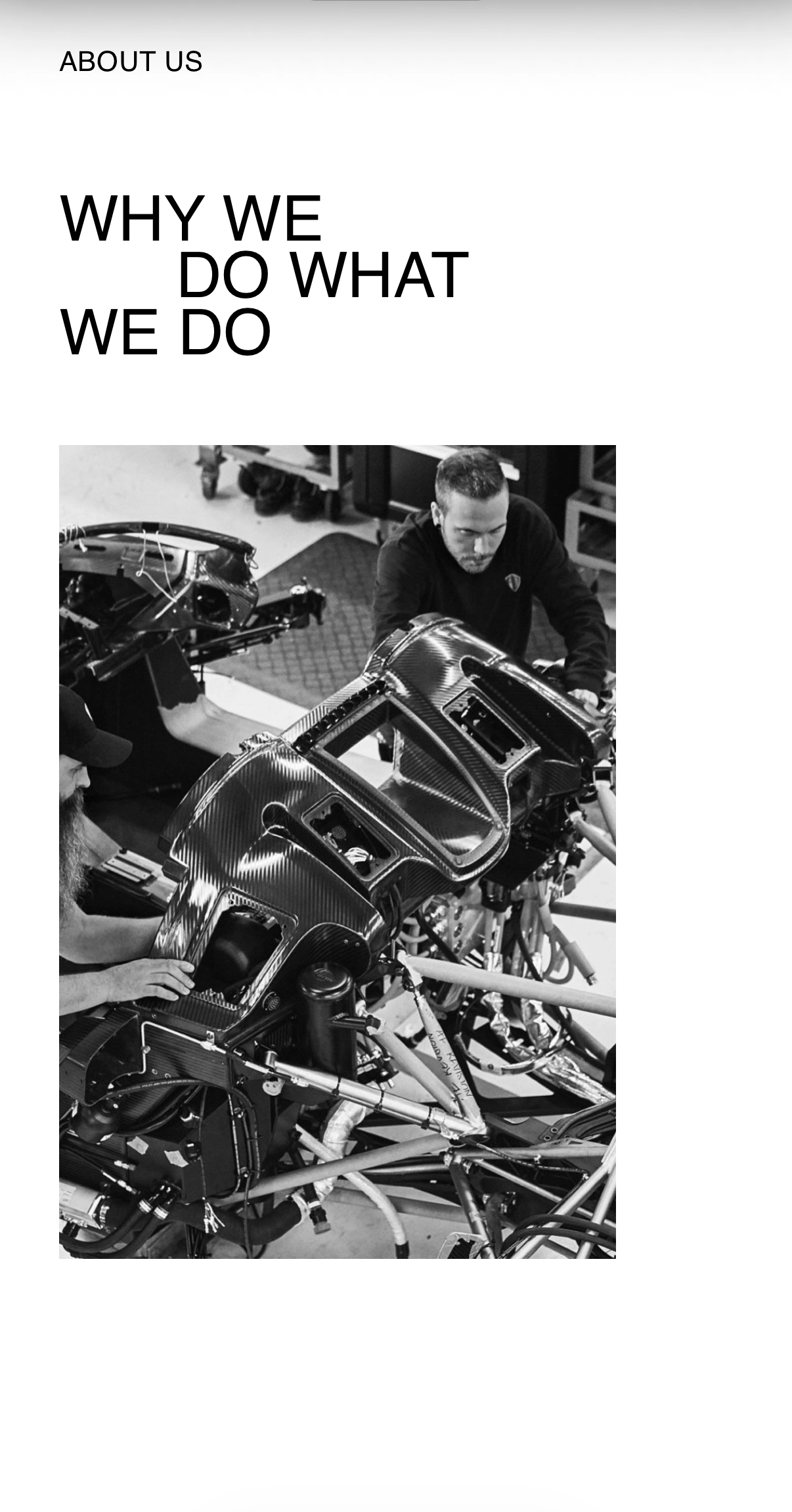
airloom.energy, apple.com, awwwards.com, behance.net, bottegaveneta.com, brandonleedesigns.com, brand.porsche.com, c2mtl.koki-kiko.com, heykuba.com, koenigsegg.com, lyambewry.co.uk, madeinuxstudio.com, marvinogah.com, nga.gov, pixelmator.com, plastic.design, siblingrivalry.com, siena.film, volvocars.com
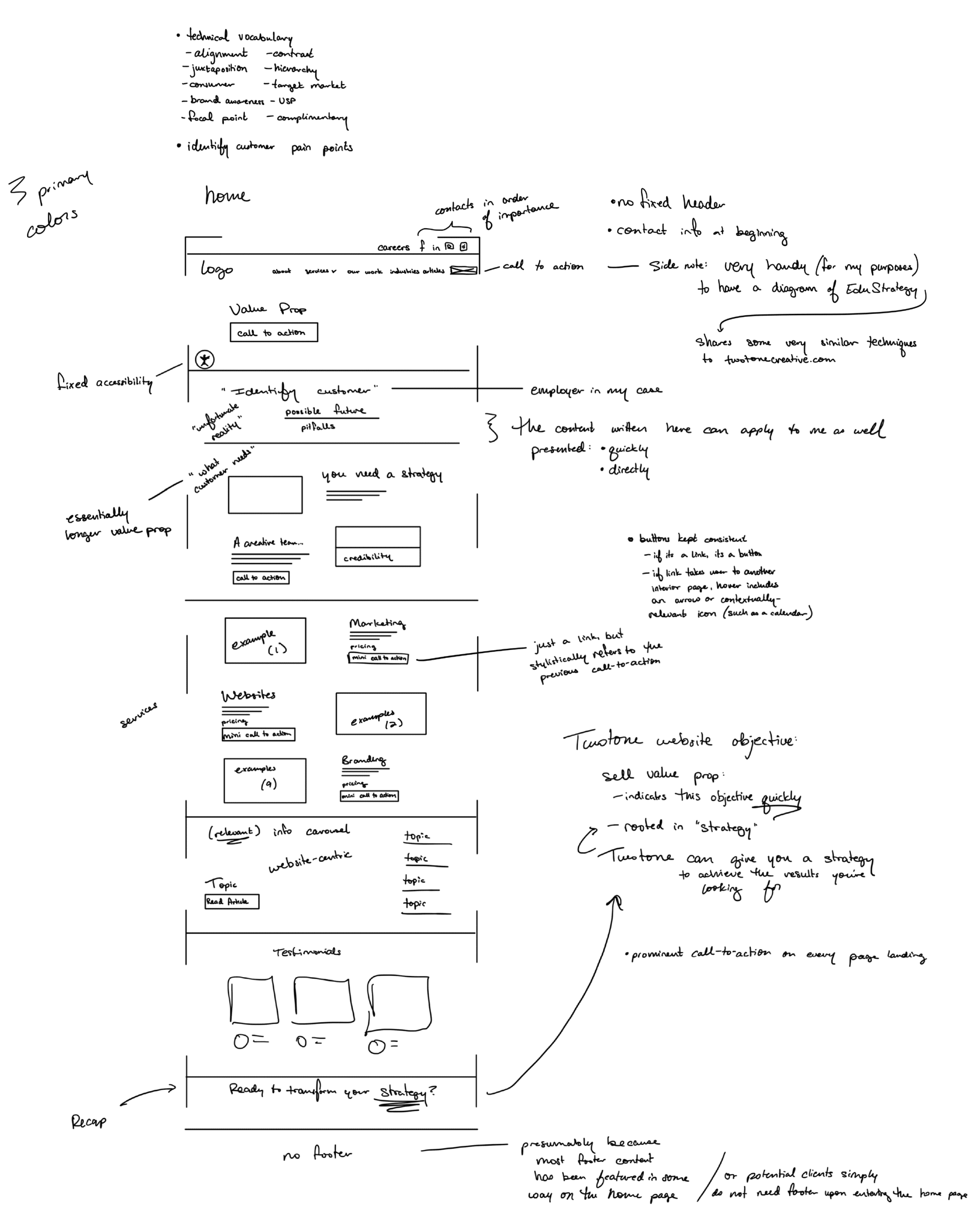
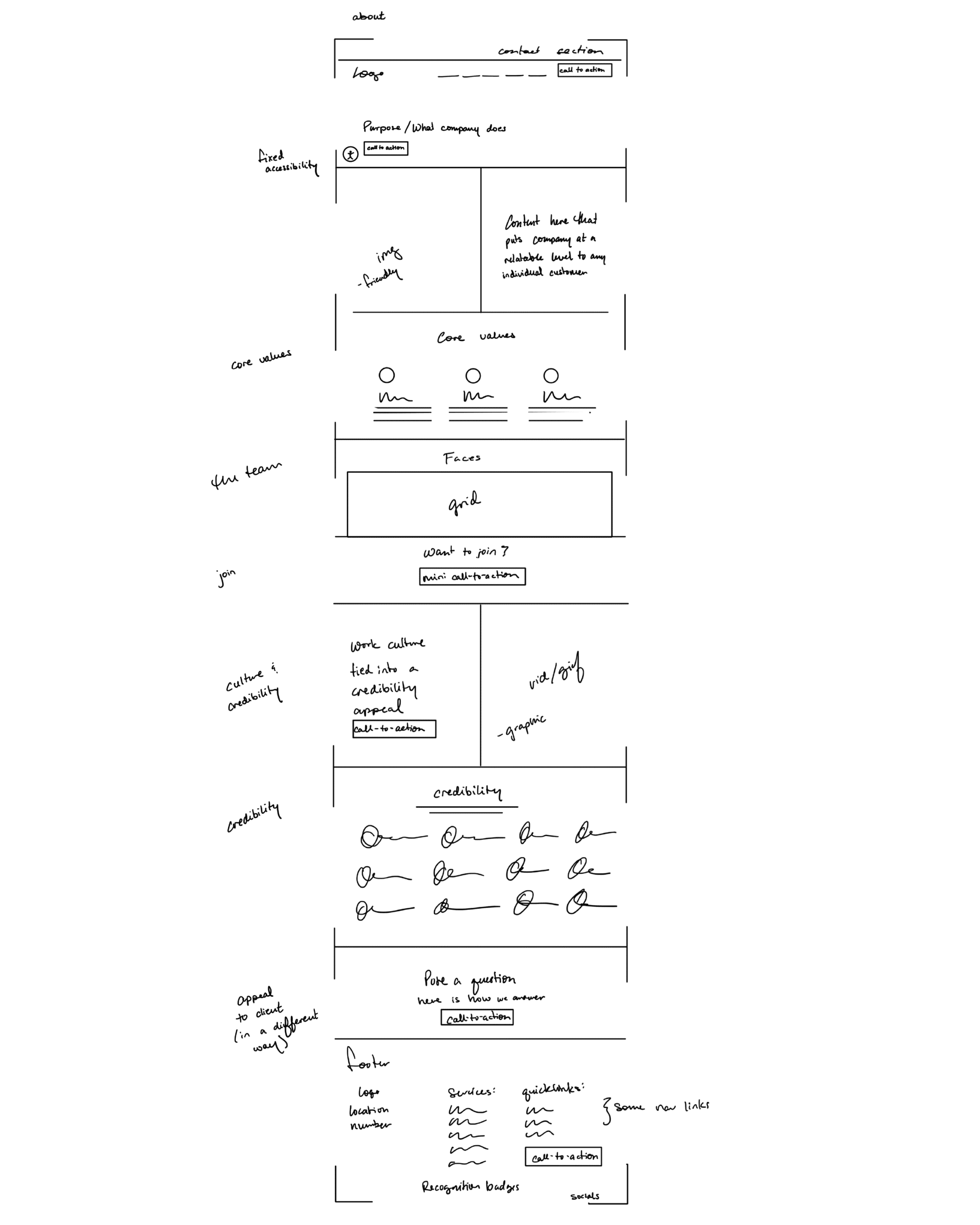
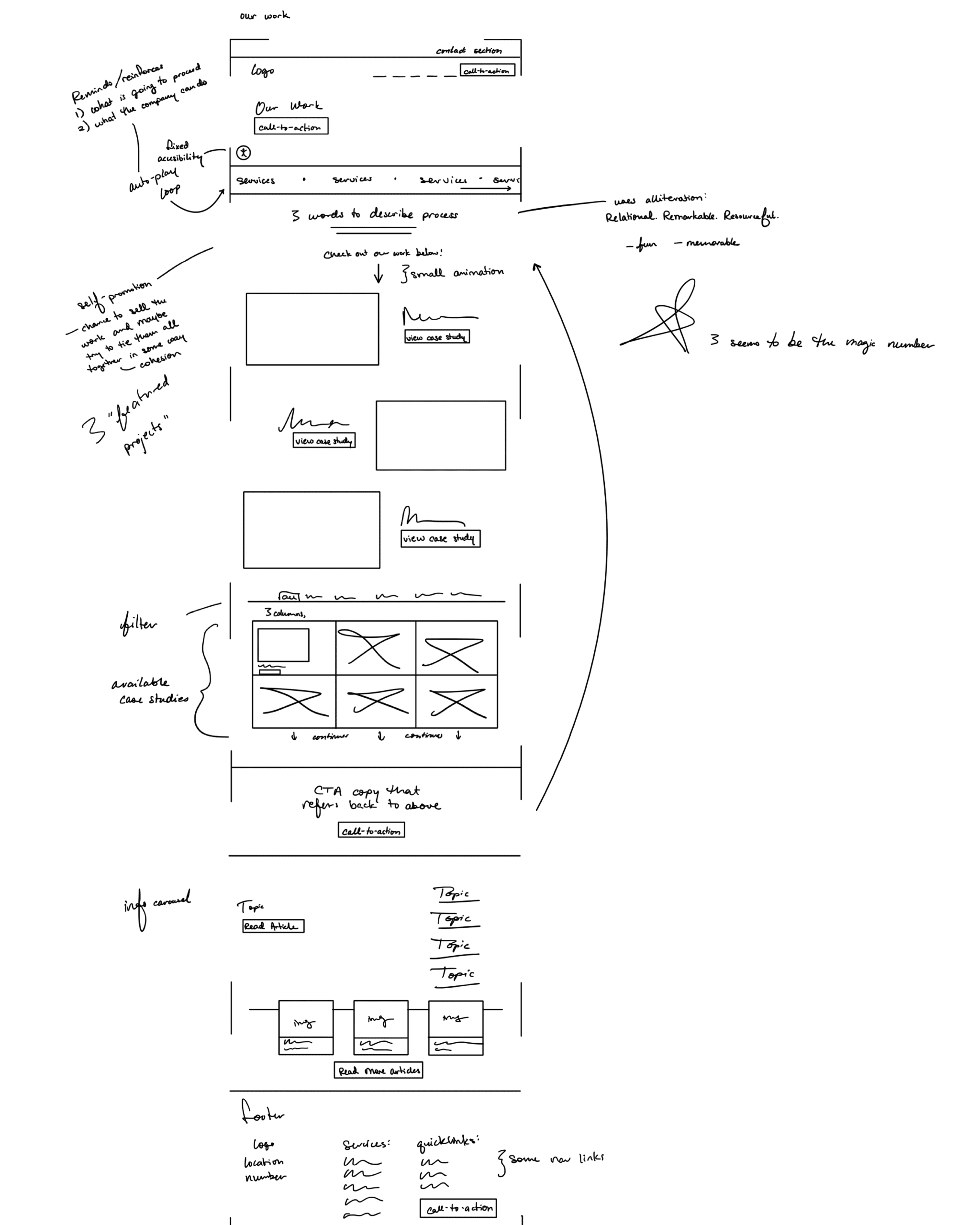
Study of TwoTone Creative
In the sketches above, I found it especially helpful to map out the website of a strategic marketing agency such as TwoTone Creative. Mapping real sites in this manner helps me run through all sorts of ideas.
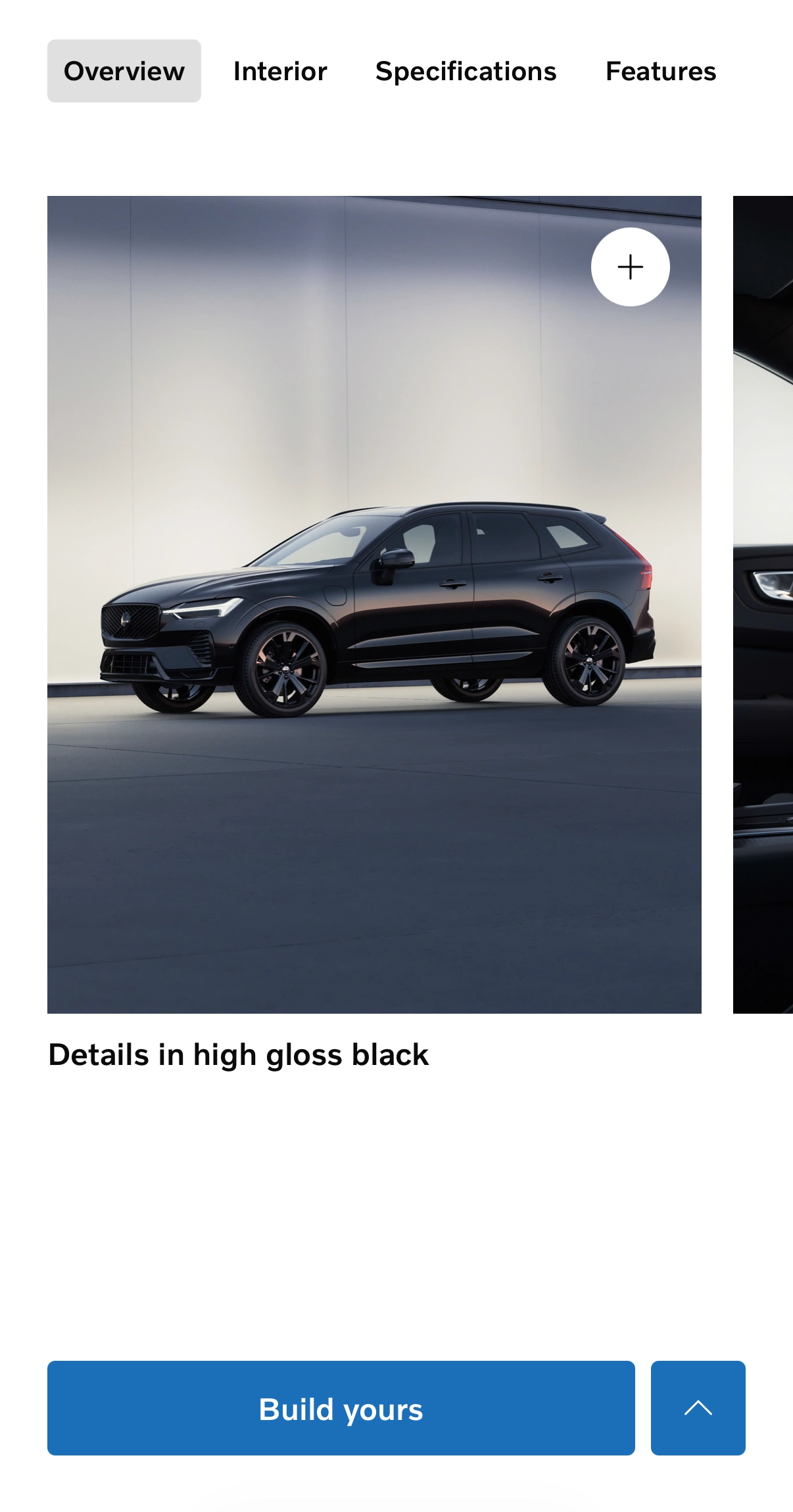
Study of Volvo and Koenigsegg
Volvo and Koenigsegg influenced the design language I sought to capture, and they just so happen to both be Swedish automotive companies. Each website showcases stunning combinations of elegance and utility.
The process
This self-directed project pushed me to learn quickly and adapt. Through iterative exploration and refinement, I shaped the outcome into a considered, cohesive experience.
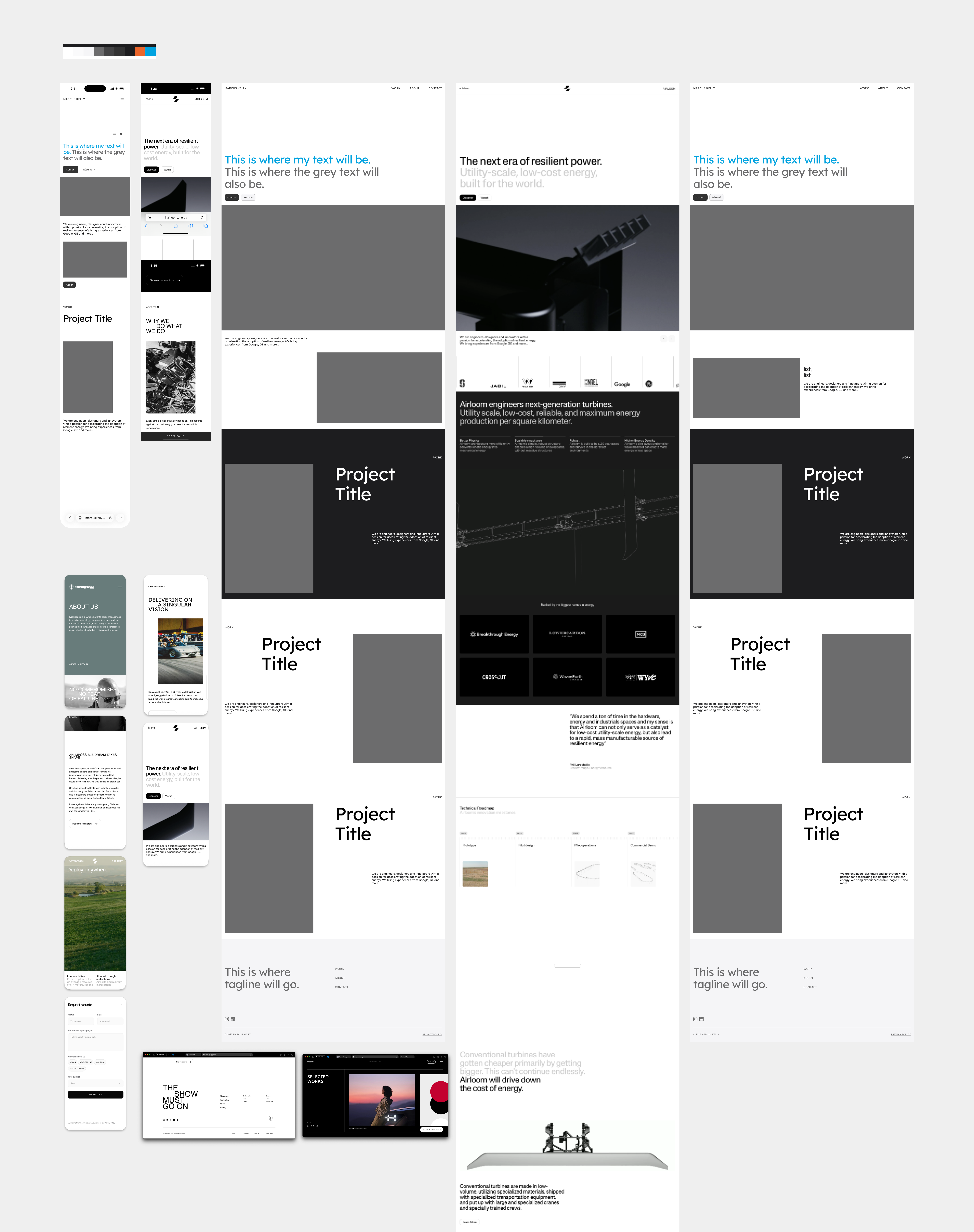
Quick, early prototyping
Above, you can see the beginnings of this portfolio site as it now exists. Early prototyping in Figma was crucial in letting me experiment and solidify a direction to move in. I found Louis Paquet’s “Innovative Web Design in Figma” course and assets from the course quite helpful in these stages.
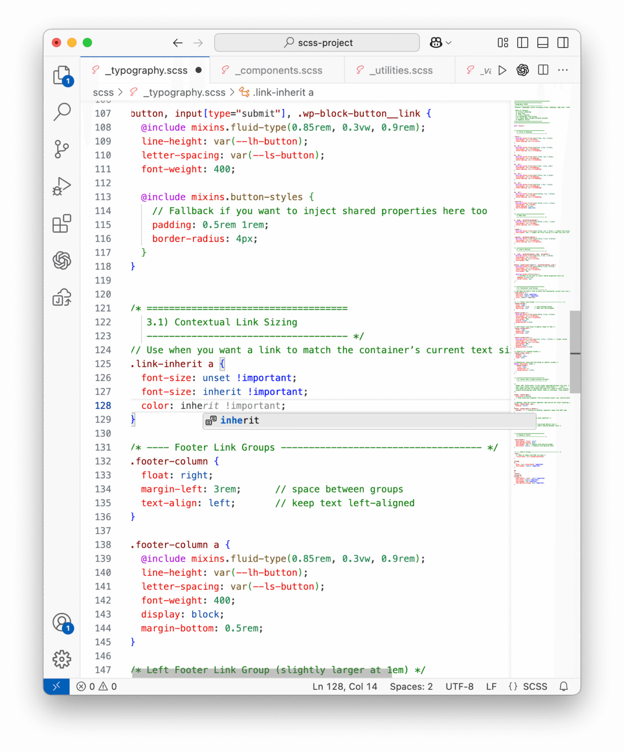
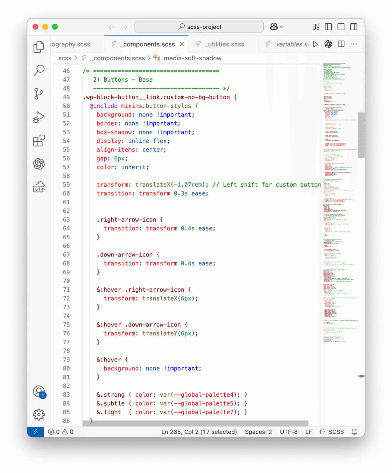
Learning SCSS
As the design system grew, I needed more structure than my CSS could offer. Moving to SCSS allowed me to organize styles modularly, speed up development, and iterate without losing consistency or control.
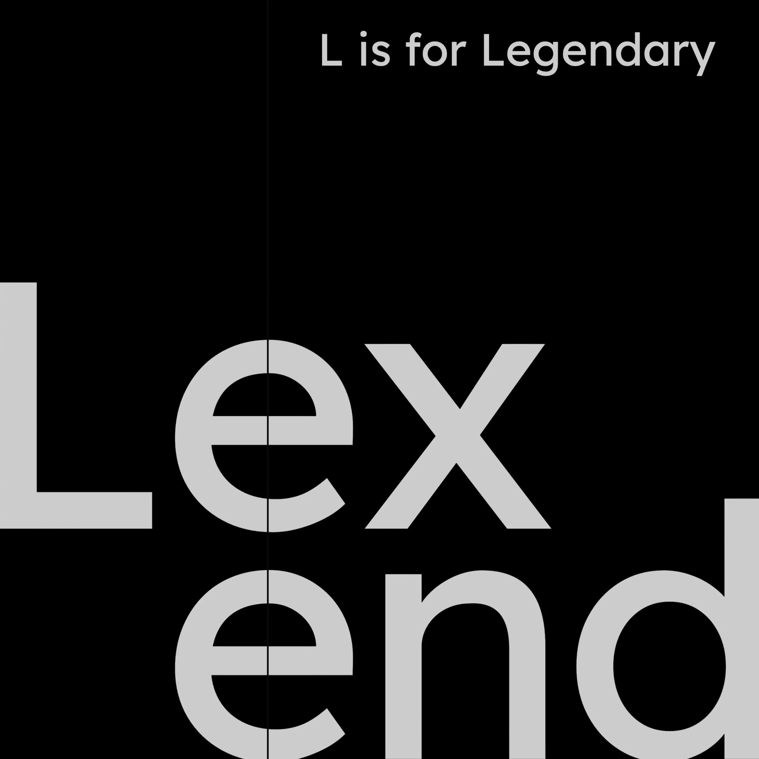
Typographic voice: Lexend
Lexend is the basis on which I formed the Marcus Kelly identity. It is clean and modern, but it doesn’t feel too clinical (although I do love a good clinical font). There’s a softness to its rhythm and an expressiveness that brings a human quality to the work.
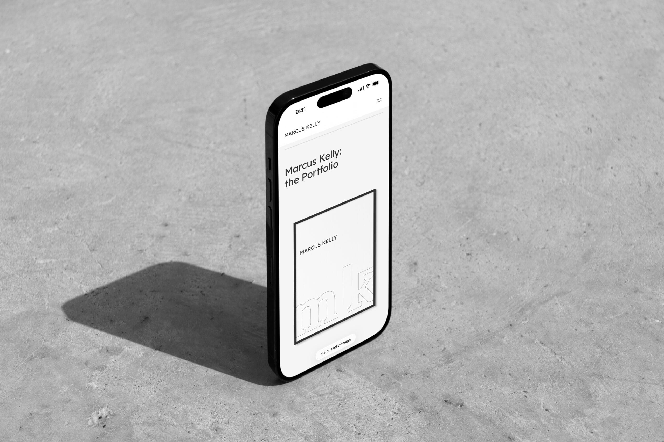
Results
This website, the one you have been interacting with, is the result. I now have a framework that can adapt to showcase my work as it evolves.
Intentionality
This project taught me a lot about building design systems that work both visually and technically. Every decision was made with balance in mind. I’m proud that this portfolio feels cohesive, personal, and genuinely mine.
Now, I am focused on continually creating small refinements to simplify the maintenance process and improve page speed scores.