MKVL 5 News
Web design, brand identity, motion graphics
Context
Team + my role
This three-person Web UI/UX project challenged us to reimagine a regional news station across brand and digital touchpoints. I collaborated with Luna and Joey, each leading different parts of the project, while I focused primarily on the website experience, handling most of the interface layout and prototype development across news, weather, live broadcast, navigation, and advertising.
Brief
MKVL 5 News is a fictional regional station serving Southeast Iowa and Northeast Missouri. Our brief positioned the station within a broader rebrand, creating an opportunity to rethink how its identity could extend from broadcast into a more useful digital news experience.
Challenge
MKVL needed a digital experience that could support the pace and variety of a regional newsroom. The existing site was not optimized for mobile, its information hierarchy made content difficult to scan, and its structure left limited room for digital advertising without disrupting the reading experience.
Solution
We approached the redesign as a flexible information system, using reusable patterns to organize stories, weather, video, and live coverage across screen sizes. Responsive navigation kept content accessible on mobile, while advertising was built into the page structure from the start, creating a system that could support both editorial and business needs.
Broadcast identity
The new visual identity needed to feel credible enough for a news organization while remaining distinct from the larger national networks viewers already recognize. Our system uses a restrained wordmark, a prominent Channel 5 identifier, and a blue-led palette that could move naturally between broadcast graphics and interface elements.

Web interface
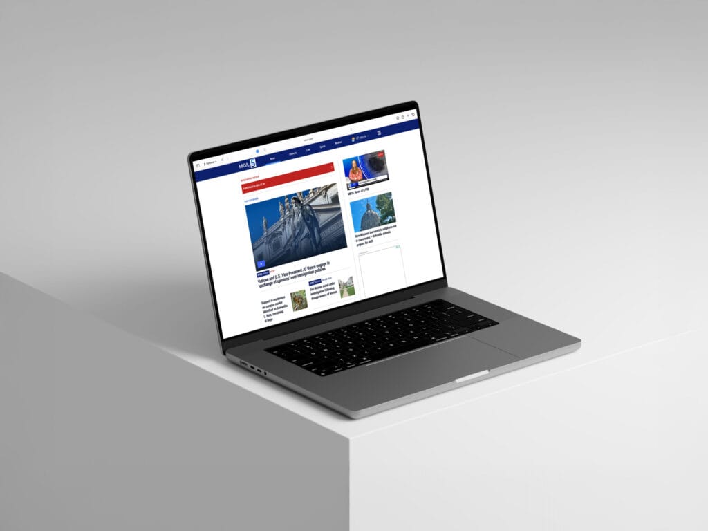
Here is an excerpt from my presentation rehearsal where I walk through some of the basic layout decisions our team agreed upon.
Designing around editorial and business needs
Advertising was a requirement, not an element to be added after the layouts were complete. We reserved predictable spaces for ads while designing the surrounding content so that sponsored placements would not break reading flow or obscure primary information.
That constraint forced us to think about the site from two perspectives at once: the viewer looking for information and the station that needs the platform to support its business.

Making dense information work on small screens
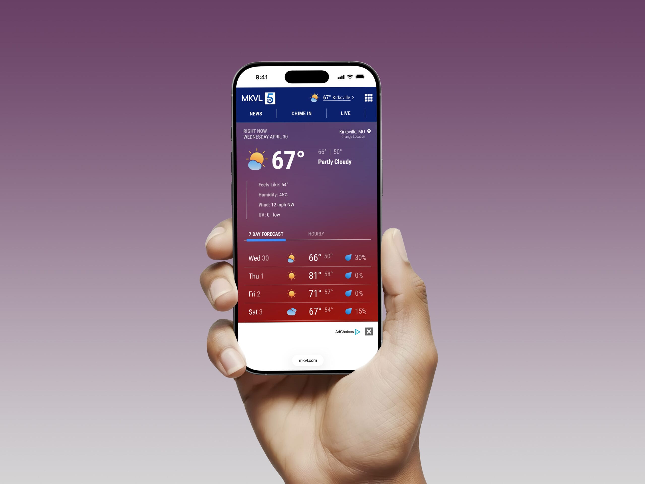
Local news interfaces have to communicate a lot at once, especially in weather. On mobile, the challenge was deciding what deserved immediate attention and what could become secondary.
We prioritized location, current conditions, and the upcoming forecast while reducing less urgent information visually. Tabs allowed additional forecast views to occupy the same space, and advertising remained visible without interrupting the primary weather task.
Designing a system, not a homepage
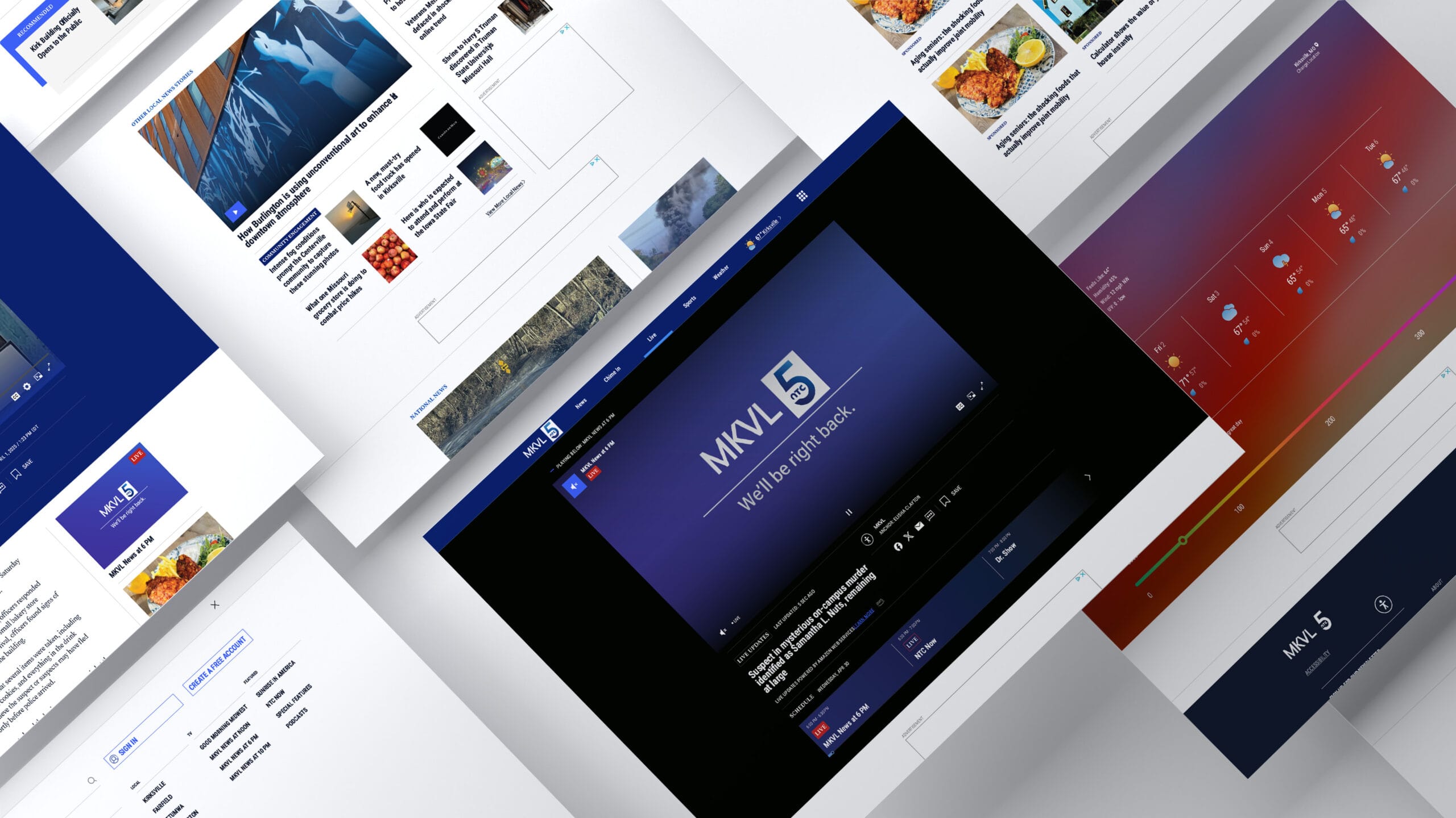
Because news content changes constantly, the interface couldn’t depend on one carefully composed screen. We developed repeatable patterns that could accommodate very different content, from breaking news and article feeds to live video and weather data, while maintaining a consistent visual hierarchy.
The prototype became a way to test whether those patterns still felt like the same product as content and screen size changed.
Keeping a large news site navigable
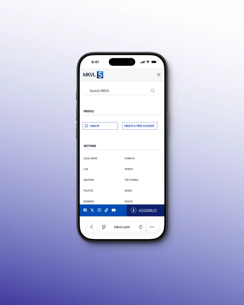
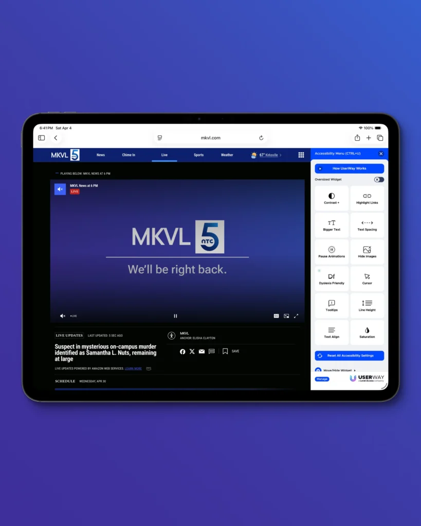
A news site can quickly outgrow a conventional mobile menu. Instead of treating navigation as a simple list of links, we organized it around distinct user needs: finding a story, accessing an account, moving between coverage areas, and reaching utility features such as accessibility.
The result keeps frequently used actions visible while allowing the broader information architecture to expand without crowding the primary navigation bar.
Project Outcome
Our final concept was presented as part of a class competition, where each team also created a fictional agency identity and pitch presentation. We presented MKVL through our agency, Snout & Co., and our proposal was selected as the winning concept.
I took the lead on the website’s interface and prototype design, but I also found myself assuming more of a coordinating role within our three-person team. I organized our group chat, shared progress updates, established deadlines, and regularly sought feedback from my teammates. I often helped us settle on a direction so we could keep moving forward. This experience taught me the value of knowing when to make a quick decision and when to involve others.