Union & Involvement Services
Team lead, design, web management
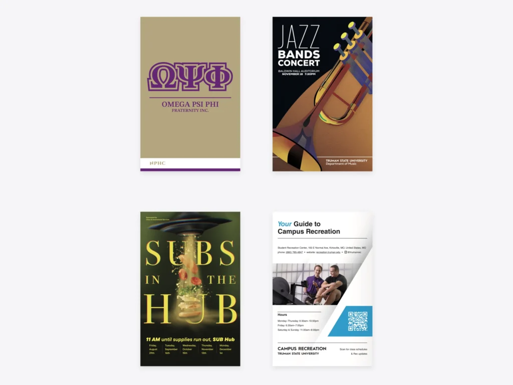
Designing Across Campus
Union & Involvement Services helps students get involved at Truman State University through campus events, student organizations, and other activities. I joined its small design team in 2024 and became Outreach Team Lead in 2026. My work ranges from maintaining websites and creating graphics to building resources and improving processes that support teammates, management, and clients.
With so many different projects, I rarely start completely from scratch. Much of my work involves finding ways to improve designs and digital experiences within existing university and partner brands. I’ve learned when to follow an established system, when to create new guidelines, and when to be more flexible.
Designing within constraints
Every campus project comes with its own audience, timeline, format, stakeholders, and brand standards. I balance these requirements in creative ways while keeping the final solution practical and consistent.


Creating consistency without erasing identity
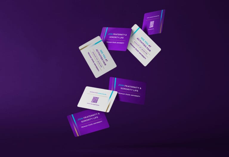
Fraternity and Sorority Life communications often draw from several identities at once: Truman, the governing council, and the individual chapter. From chapter-specific banners to shared recruitment materials and longer publications, I adapt the visual hierarchy to each format while keeping the broader system recognizable.
To preserve the identity of each organization, I made color the most flexible and defining element of this system. For example, Delta Zeta’s colors draw from the pink Killarney rose, the sorority’s official flower, so maintaining that connection was important. Alpha Gamma Delta, on the other hand, uses three colors central to its identity. Rather than forcing the organization into the two-color approach of other organizations, I adapted the system to accommodate all three.
Typography, spacing, and other visual elements carry different levels of importance across organizations, and some don’t have publicly accessible brand guidelines at all. This gave me room to make design decisions while respecting each organization’s established identity. By keeping placement and typography consistent while allowing color to vary, I could bring these different organizations together under one recognizable scheme without sacrificing what makes each distinct.
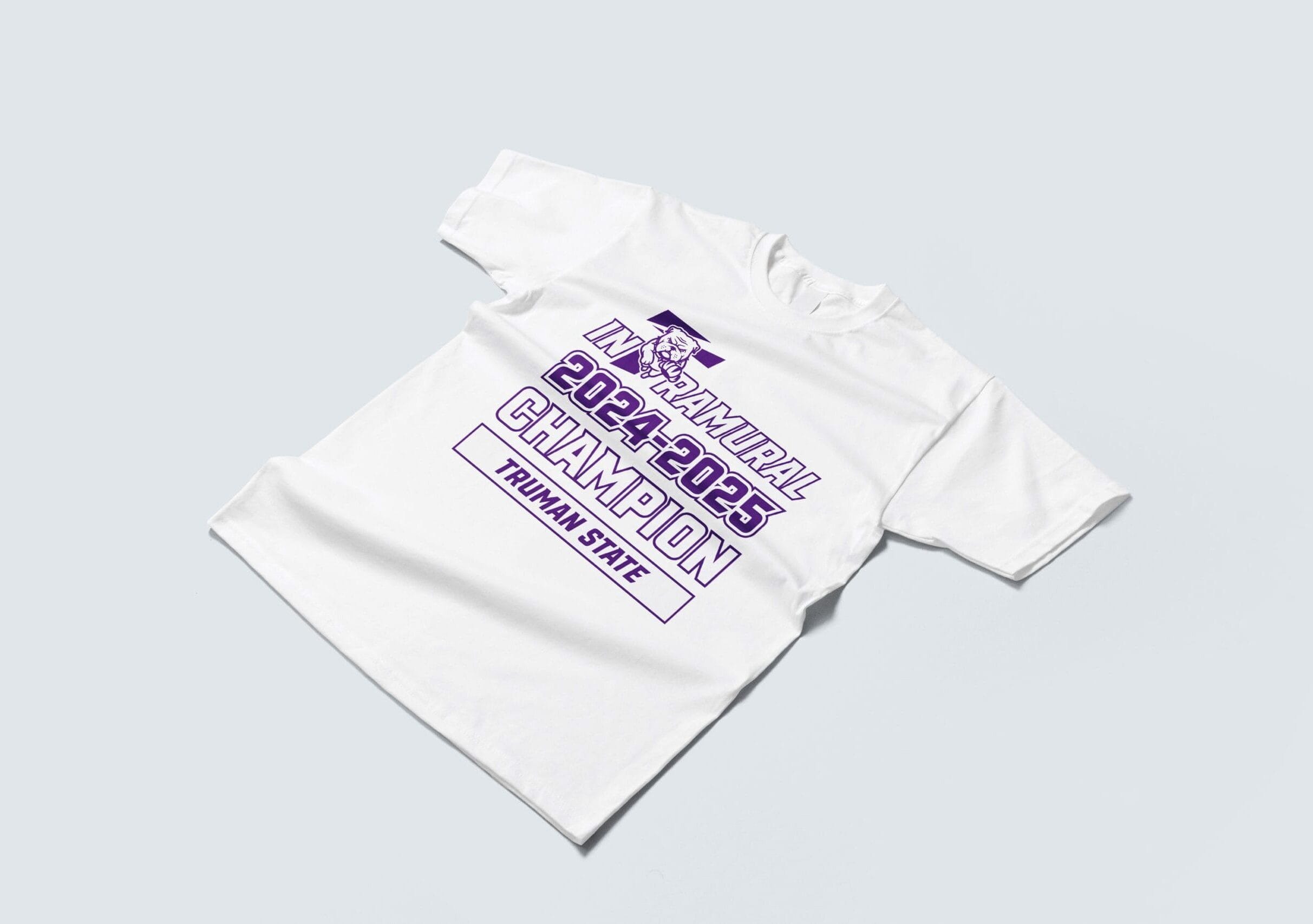

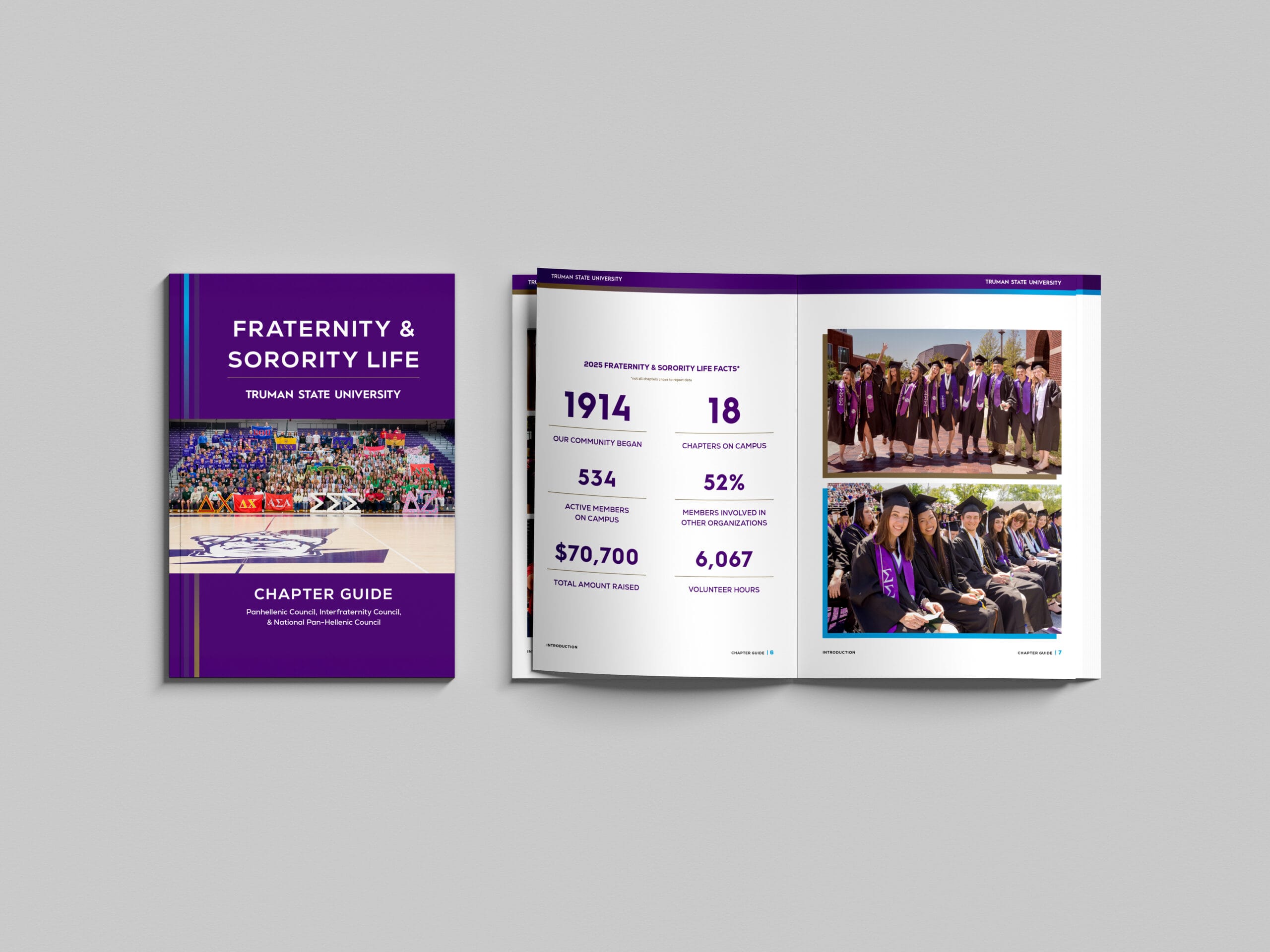
Upholding university standards
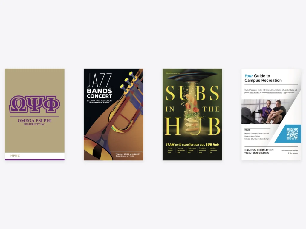
Many of the materials I design need to feel recognizable as part of the Truman community. I use the university’s existing visual identity as a foundation, organizing typography, color, and supporting graphics around a clear message.
This approach is intentional. While there are certainly times when designing something entirely new makes sense, I’ve found that building upon an established visual system is often more effective than starting from scratch. It allows me to focus less on reinventing individual elements and more on solving the problem at hand, all while maintaining consistency and saving time.
Websites and user experiences
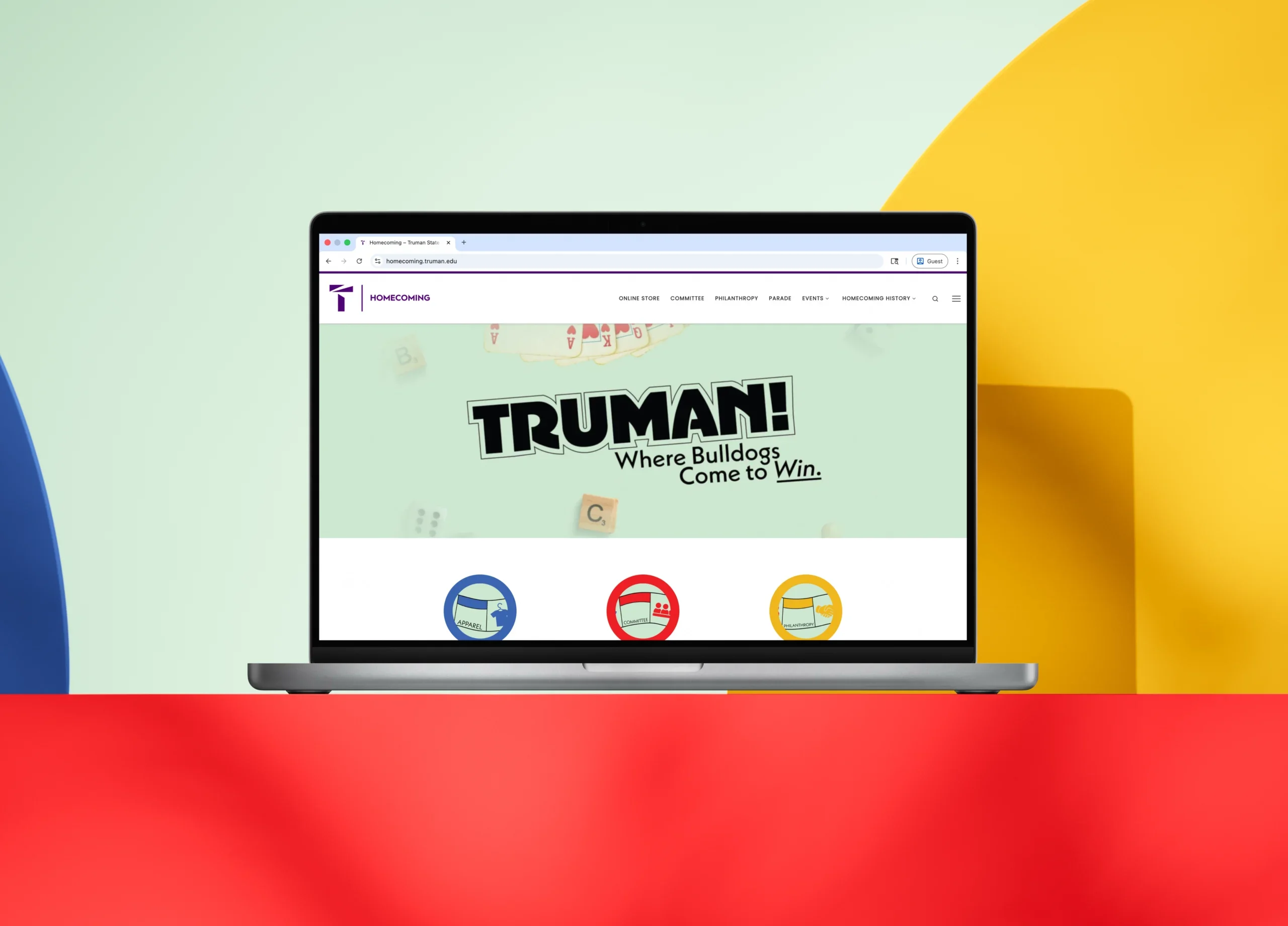
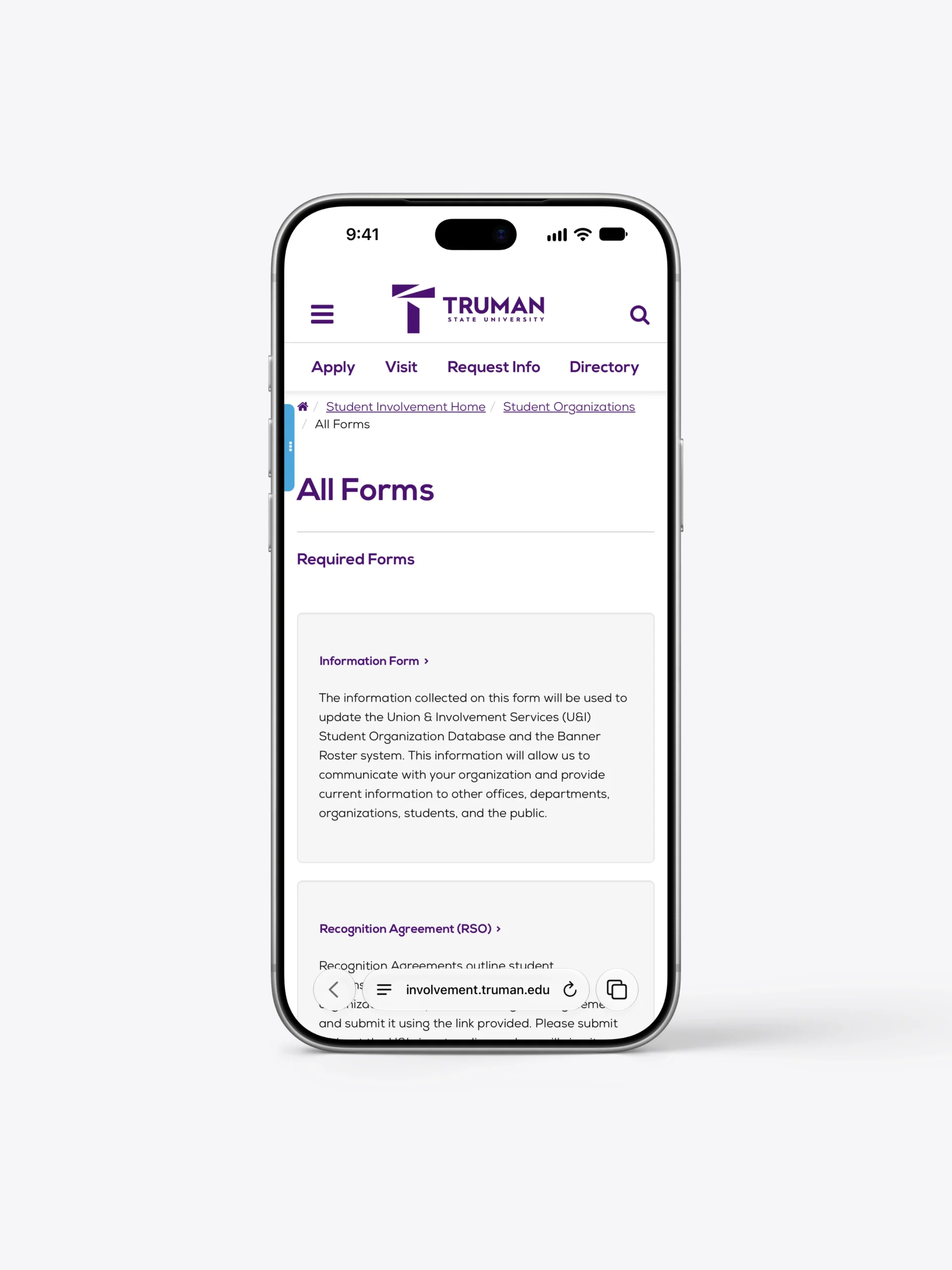
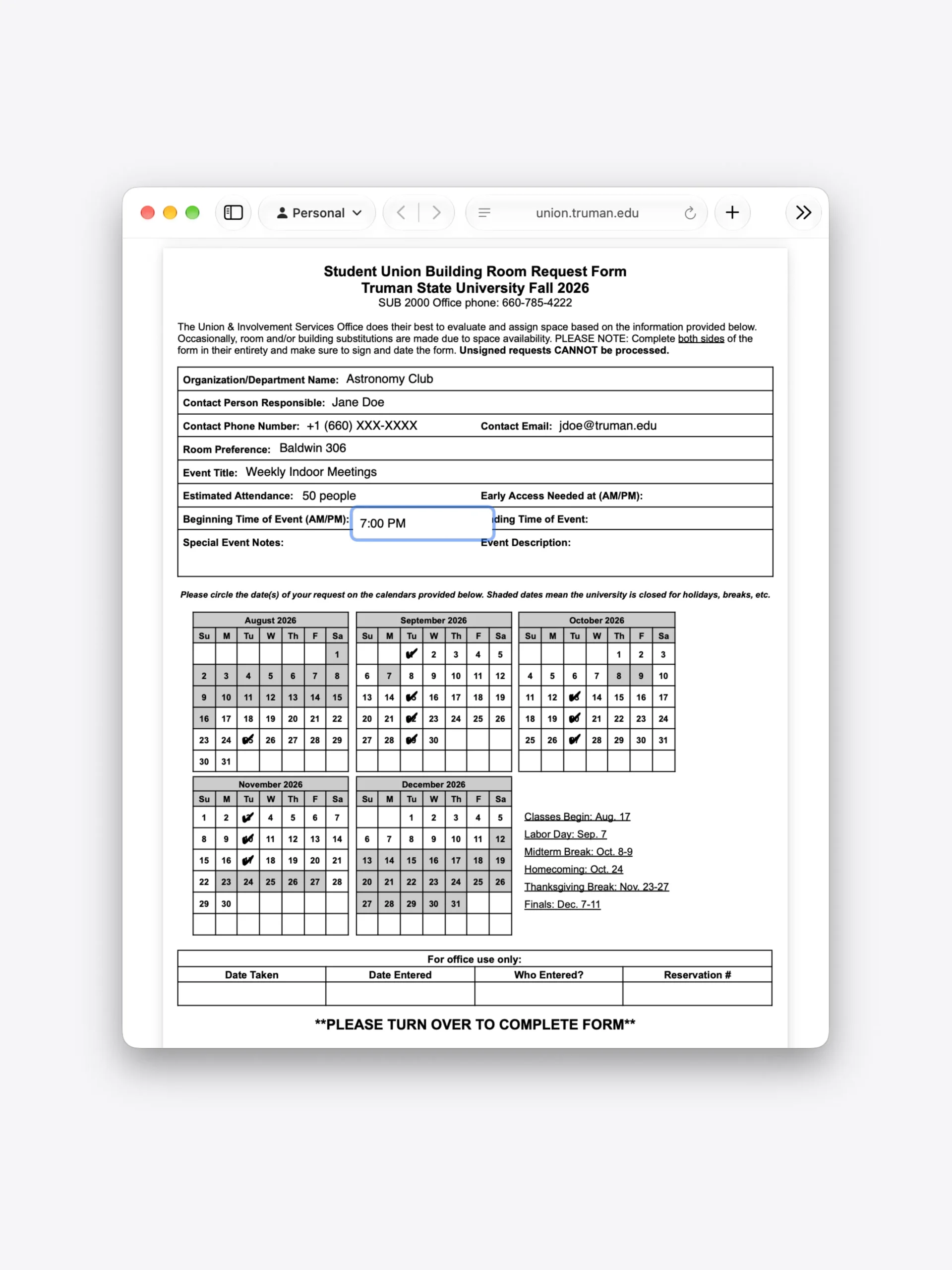
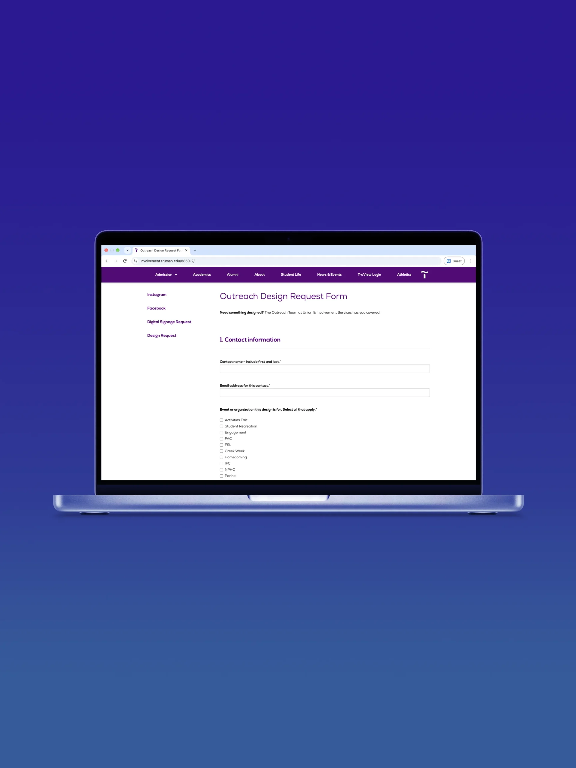
My work includes managing Truman websites, improving interactive PDF forms, and maintaining my team’s task organization system. While each serves a different purpose, I’m always looking for ways to make them easier to use.
AI automation and workflow
Our team previously managed design requests through Google Forms and spreadsheets. While the process worked, it made tracking individual projects unnecessarily difficult and wasn’t always the best experience for the people submitting requests.
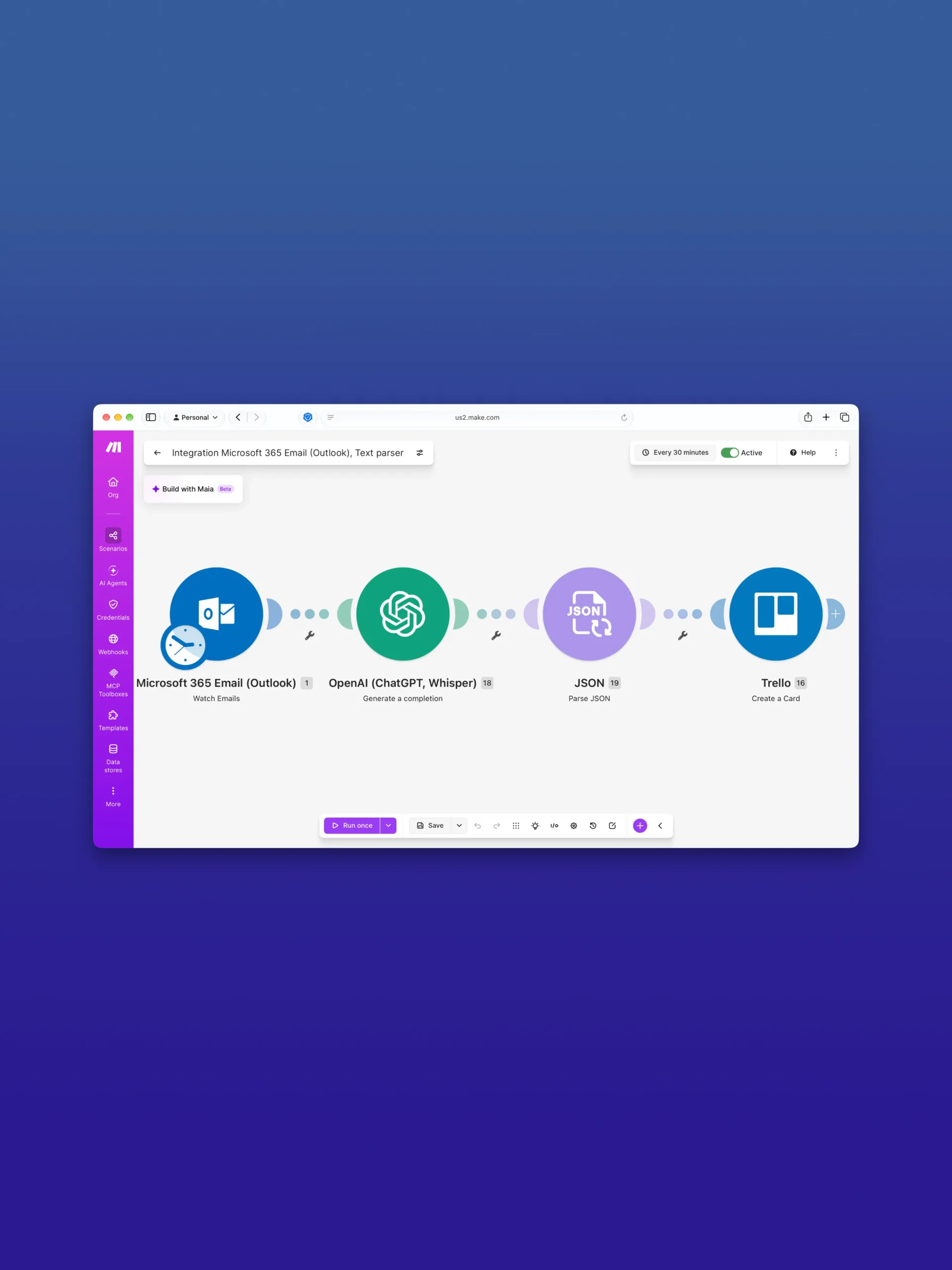
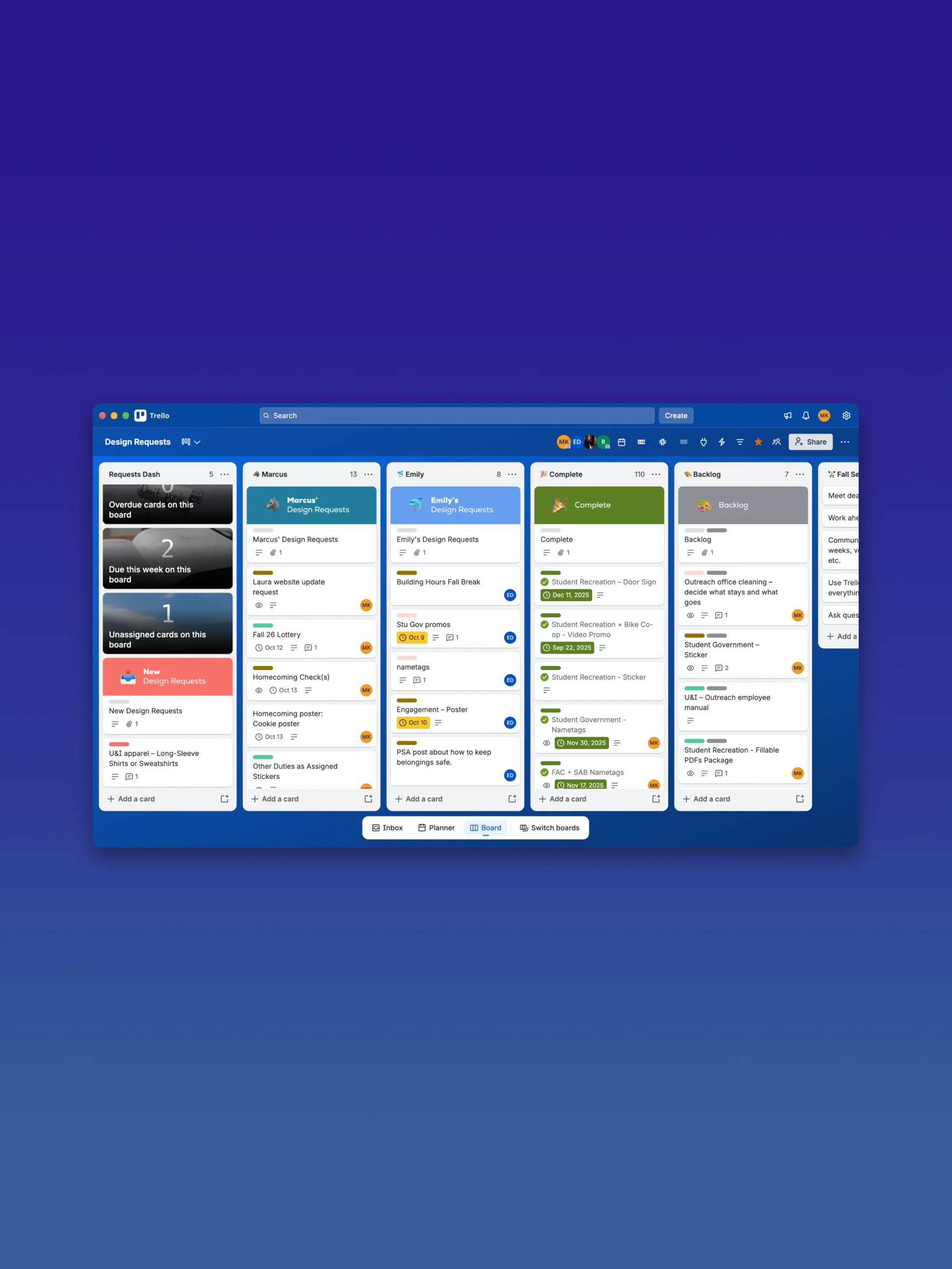
I wanted to make the process easier on both sides. I created a new online request form and connected it to an automated workflow that organizes submissions into Trello cards. Using Make and the OpenAI API, the system extracts and organizes project details, giving designers a clearer overview of their assignments.
I considered how my coworkers would adjust to the new system. Many were frustrated with the previous process, unfamiliar with Trello, and ultimately just wanted to get their work done without unnecessary complications. With that in mind, I created a short onboarding guide that would appear when users first opened the Trello board, explaining the basics of navigating and managing tasks. The guide would continue appearing on subsequent visits unless users chose to dismiss it permanently.
With the new system, tasks became easier to organize and track. My teammates expressed appreciation for the intuitive drag-and-drop cards, and I noticed a change in how we spent our team meetings. Rather than spending time trying to understand and reconcile everyone’s workloads, we focused more on discussing projects and delegating responsibilities.
Physical environments
Wayfinding and identification require a complete understanding of the spaces they occupy and the people they assist. In the following examples, my goal in distilling information is to get people to understand it faster.
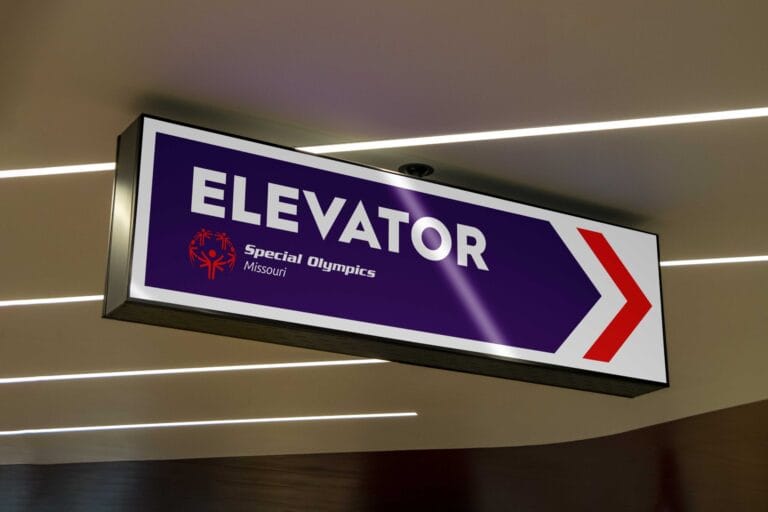
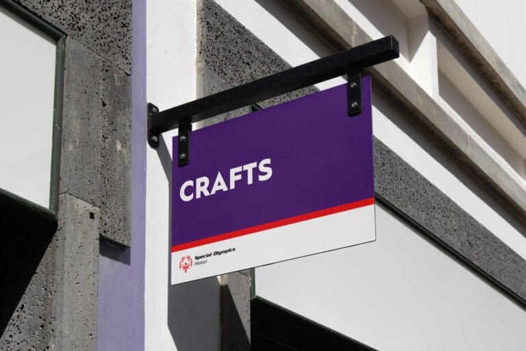
Additional signage for Special Olympics Missouri
Truman State University is a proud host of the SOMO State Summer Games. For the events, I designed additional wayfinding signage for specific use cases, following SOMO’s established visual conventions to ensure consistency throughout the venues.
I was grateful for the opportunity to contribute to the work of such an important nonprofit. I was also excited to explore SOMO’s professional design files and see how their team approached layouts, iterations, typography, layer organization, and file naming conventions. It was a valuable opportunity to learn how an established organization’s design system is structured and maintained behind the scenes.
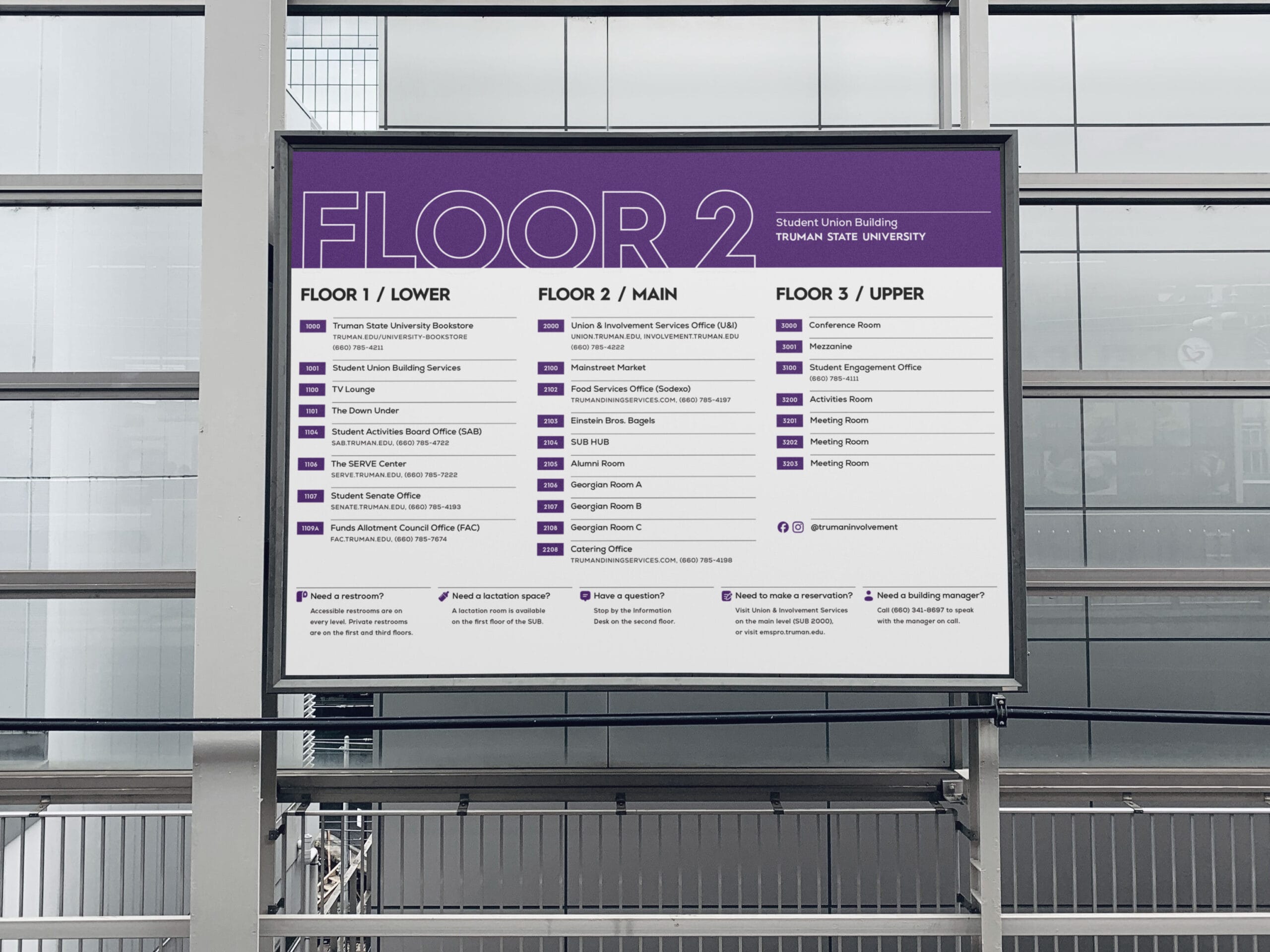


Campaigns and events
I design campus campaigns and events, large and small, to build anticipation and help students take part. This requires consistency and effective communication of practical information.
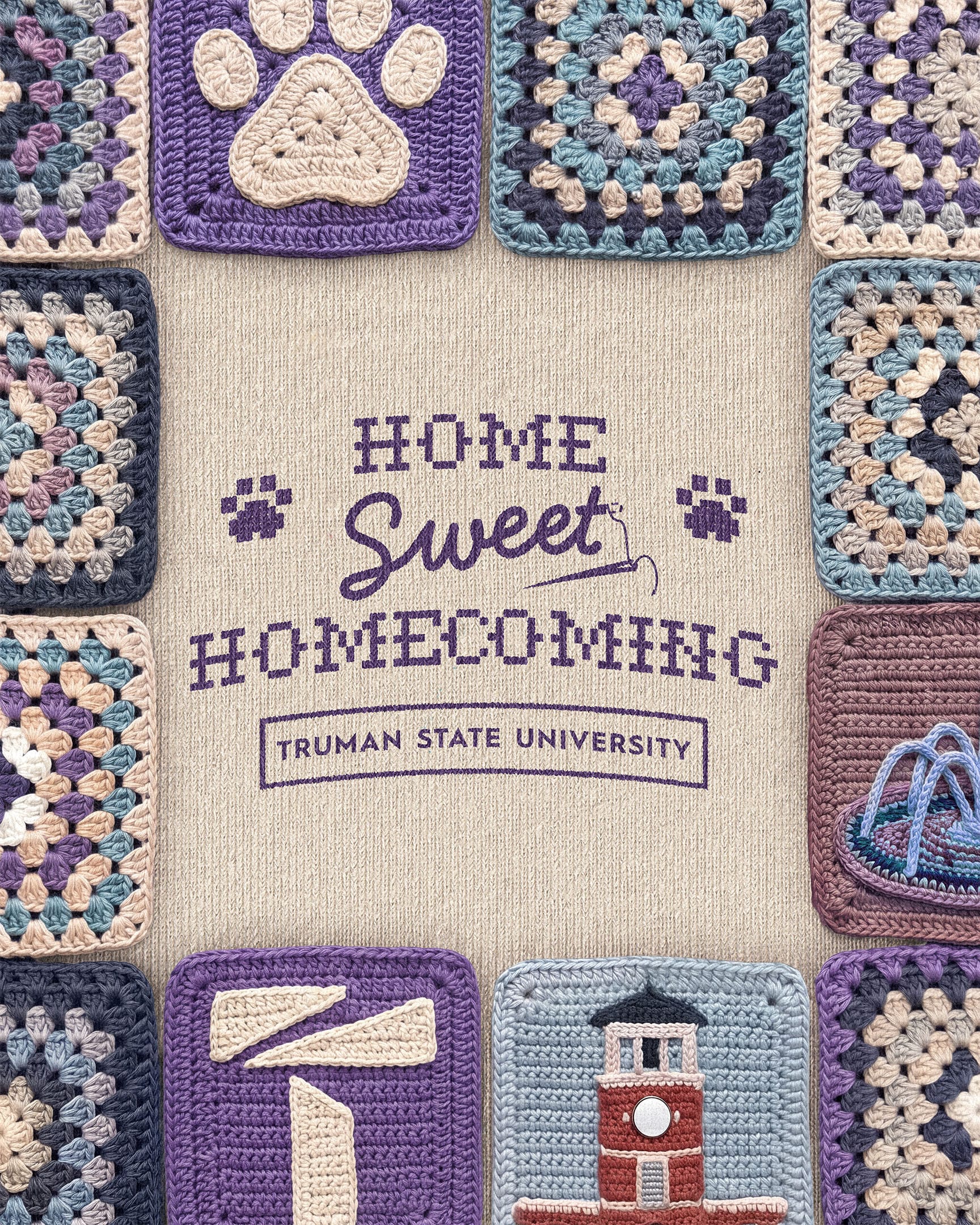
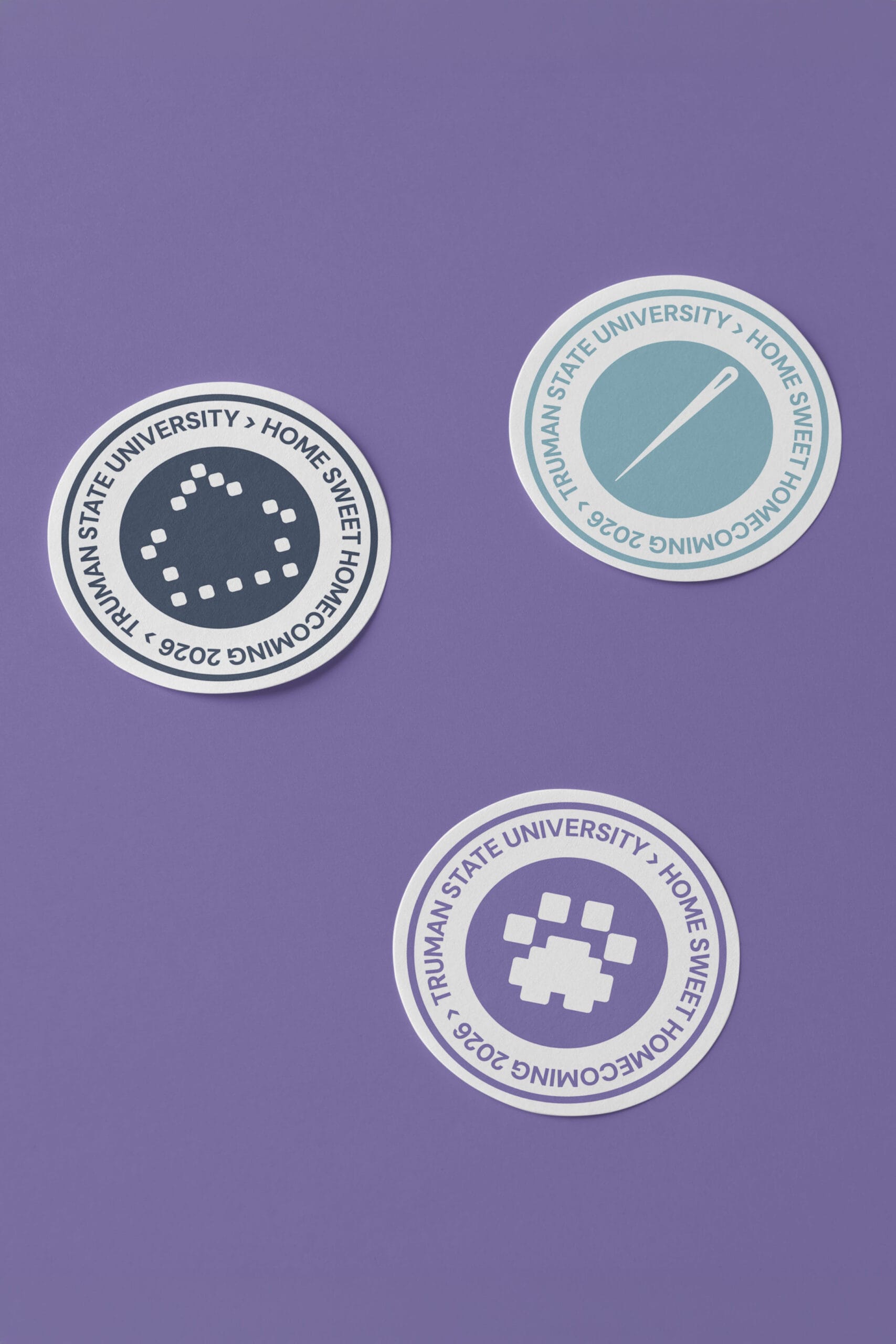
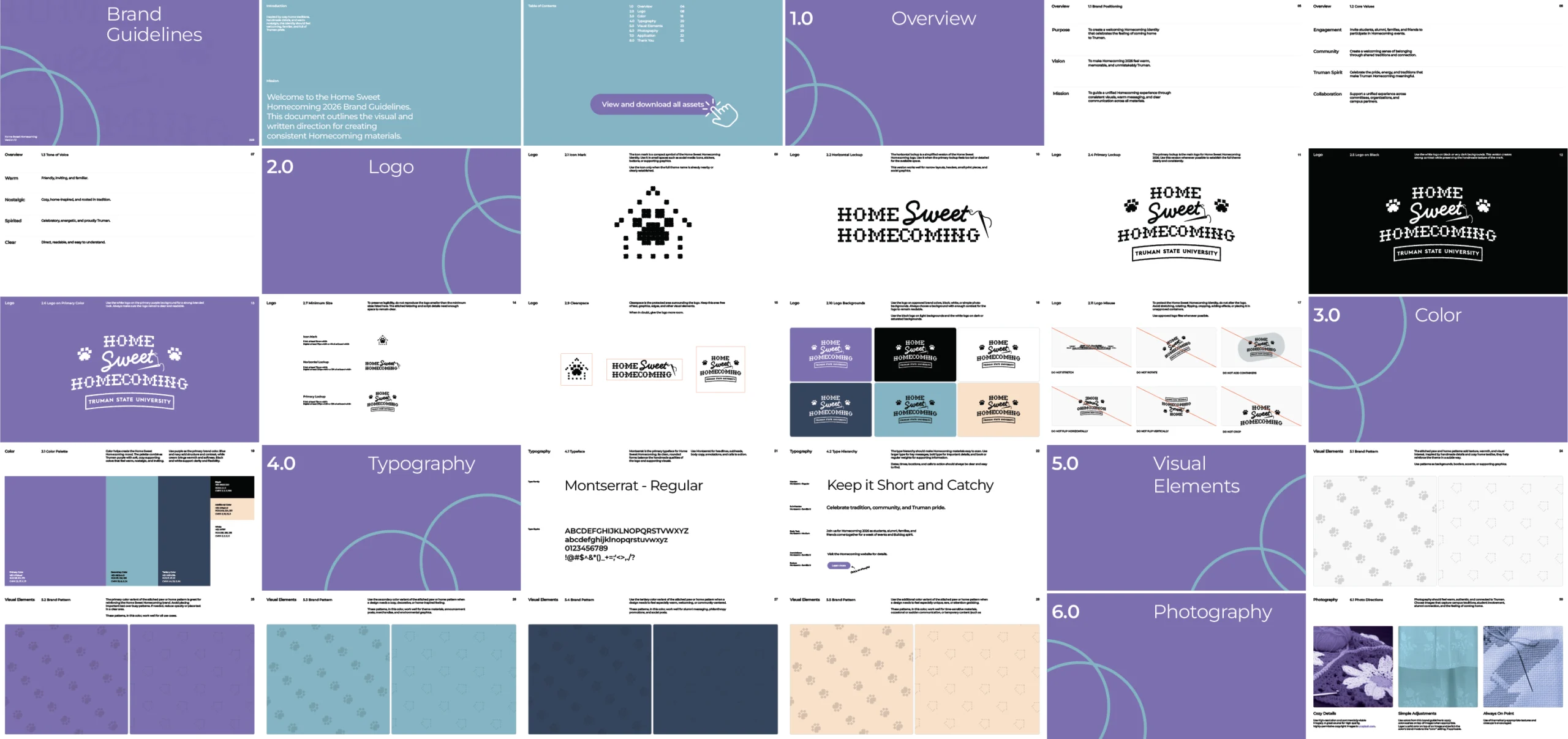
Truman Homecoming
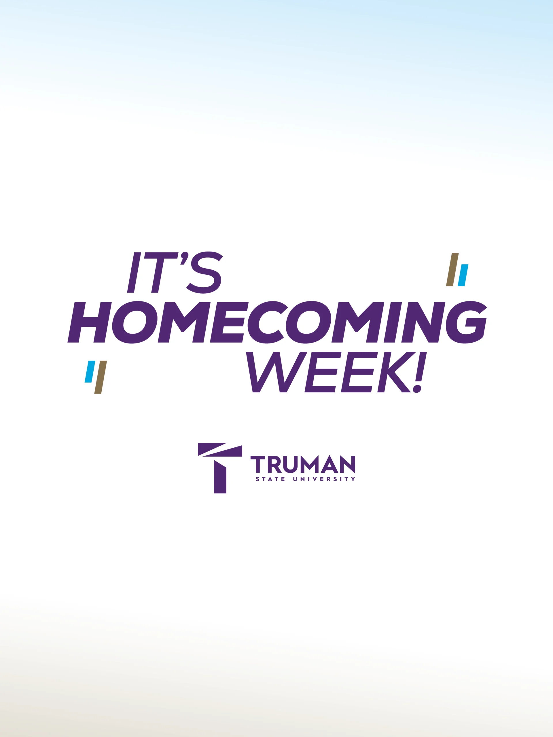
I develop Homecoming’s visual identity and create guidelines that help others carry it across their own materials. I extend that identity across apparel, the Homecoming website, stickers, event tickets, and other ephemera. My work gives the celebration a cohesive visual presence, from the first announcement to the keepsakes students take home.
I approached Homecoming 2026 differently than in previous years. A fellow designer and teammate had recently led a very successful campaign for our annual Greek Week, a week-long celebration held in the spring. She walked me through her presentation and client meeting processes, sharing what had resonated most with coordinators and committee members. More importantly, she introduced me to a different way of working. She wasn’t afraid to show me the messy, the unfinished, or even the bad ideas, and she brought that same openness to the people she was designing for. Seeing her embrace the iterative process encouraged me to reconsider my own approach.
I took her insights into the project and made the most of an unusually early start. Thanks to a well-organized Homecoming Coordinator (Hi Matthew), planning for Homecoming 2026 began months earlier than in previous years. Rather than jumping straight into visual concepts, I used our first meetings to ask broader questions about the direction of the celebration. These conversations helped me understand the outcomes stakeholders wanted to achieve before I began designing. By taking more time to establish a shared direction upfront, I was able to approach the visual work with greater purpose and fewer assumptions.


All that jazz
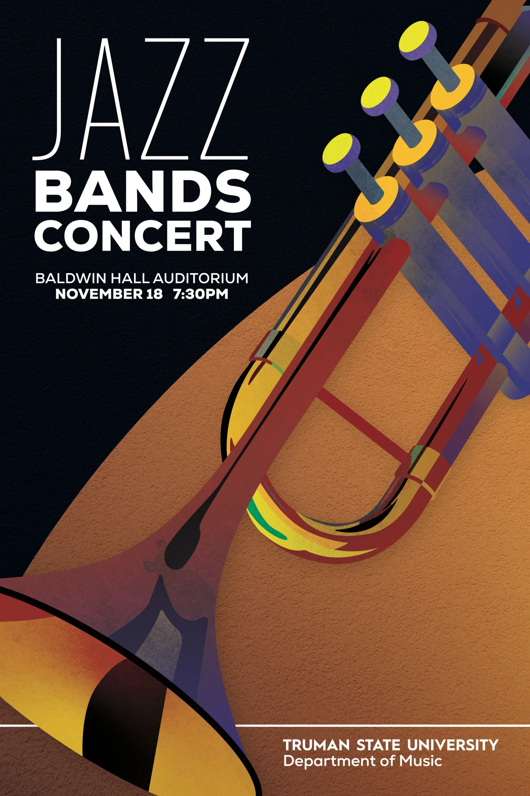
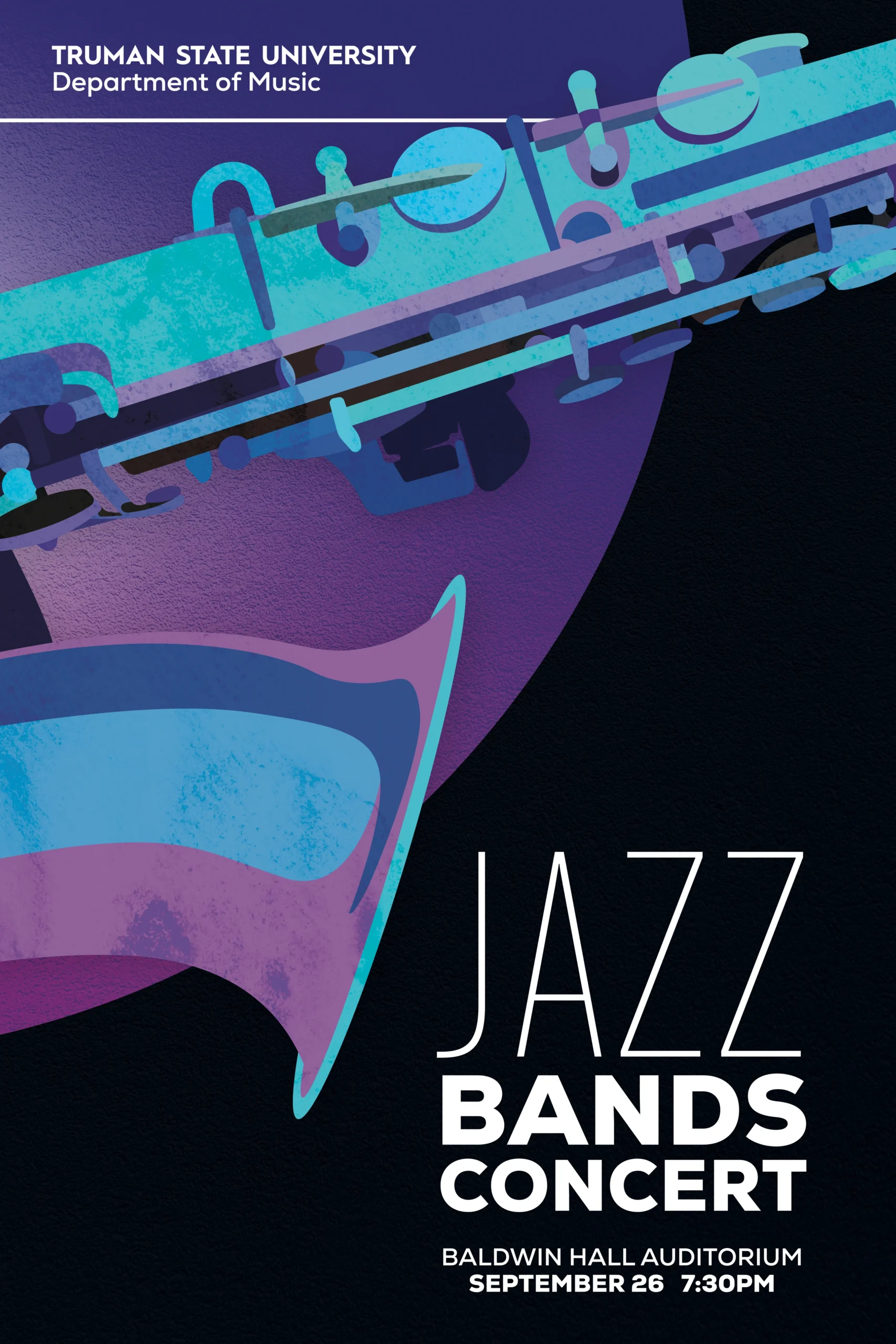
Music, particularly jazz, has been an important part of my life. Through my involvement in the Truman Jazz Ensemble, I’ve had the opportunity to serve as the designer for several major jazz-related events on campus. I find it especially rewarding to design for people I know through music, bringing a personal connection to both the clients and the work itself.
For each Jazz Festival, I look to the guest artist for inspiration. The design for Truman’s 57th annual Jazz Festival draws from the shapes and reflective surfaces of a trombone, the instrument played by guest artist Alan Ferber. I selectively used negative space within the letterforms and numbers, rounded corners, and brass-toned gradients to reference the curves, airiness, and metallic qualities of the instrument.
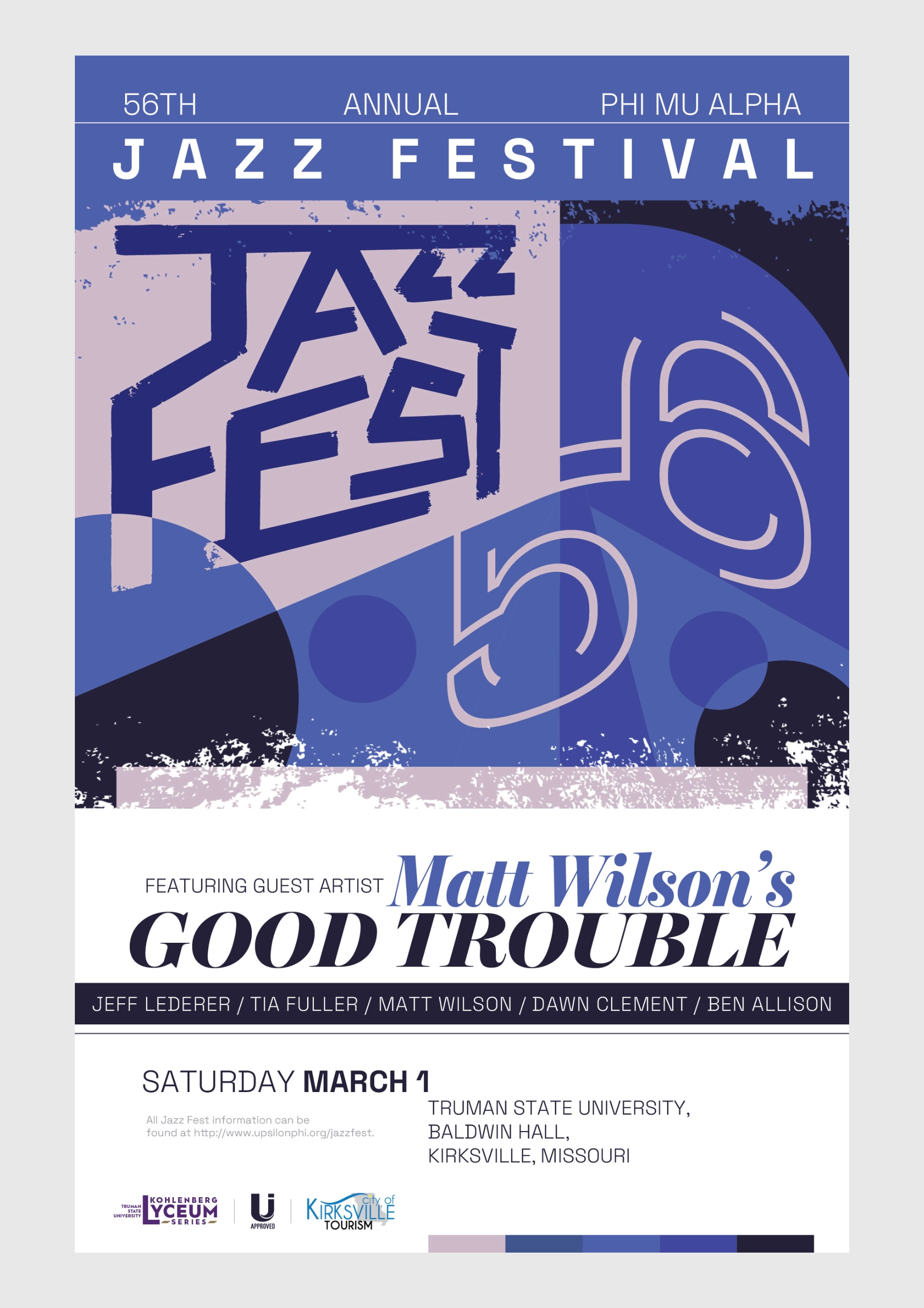
For the 56th Jazz Festival, I took a different approach. With a drummer as the featured artist, I built the design around circular forms inspired by cymbals and drumheads. Rather than repeating the same visual approach year after year, I believe each festival deserves a distinct identity that reflects the musician at its center.